Time to resit 3.2
Casey Voogt
Social-CD
Fail
Feedback:
We really appreciated the effort you put into your work during the whole trimester and your strong investment in the class. Your research presented interesting mappings and strong analyses of the design of the space. You started your project by looking at how McDonald\'s influences kids\' behaviour and manipulates them. However we miss your own definition of what addiction is. We don\'t understand the relationship between your research and your final proposal of involving kids in redesign mcdonalds. How does this relate to addiction? And are you not at the end reinforcing what you have been criticizing in the first place? The position of your project remains unclear to us. Is your final proposal a criticism toward the existing mcdonalds system or a kind of participatory design methods that mcdonals could use to improve their space by including the user? We would like you to clarify if your project is for or against the mcdonald chain. Then regarding your cardboard models we appreciate that you try to give shape to your ideas however their execution lacked rigour. Your project will be stronger and more coherent if you clarify its position. We see potential in further development of your ideas in a resit.
Assessment criteria:
Student shows adequate ability to grow and change.
Student shows inadequate ability to critically reflect.
Student shows inadequate amount of context awareness.

Casey Voogt - Social Practice Cultural Diversity 3.1
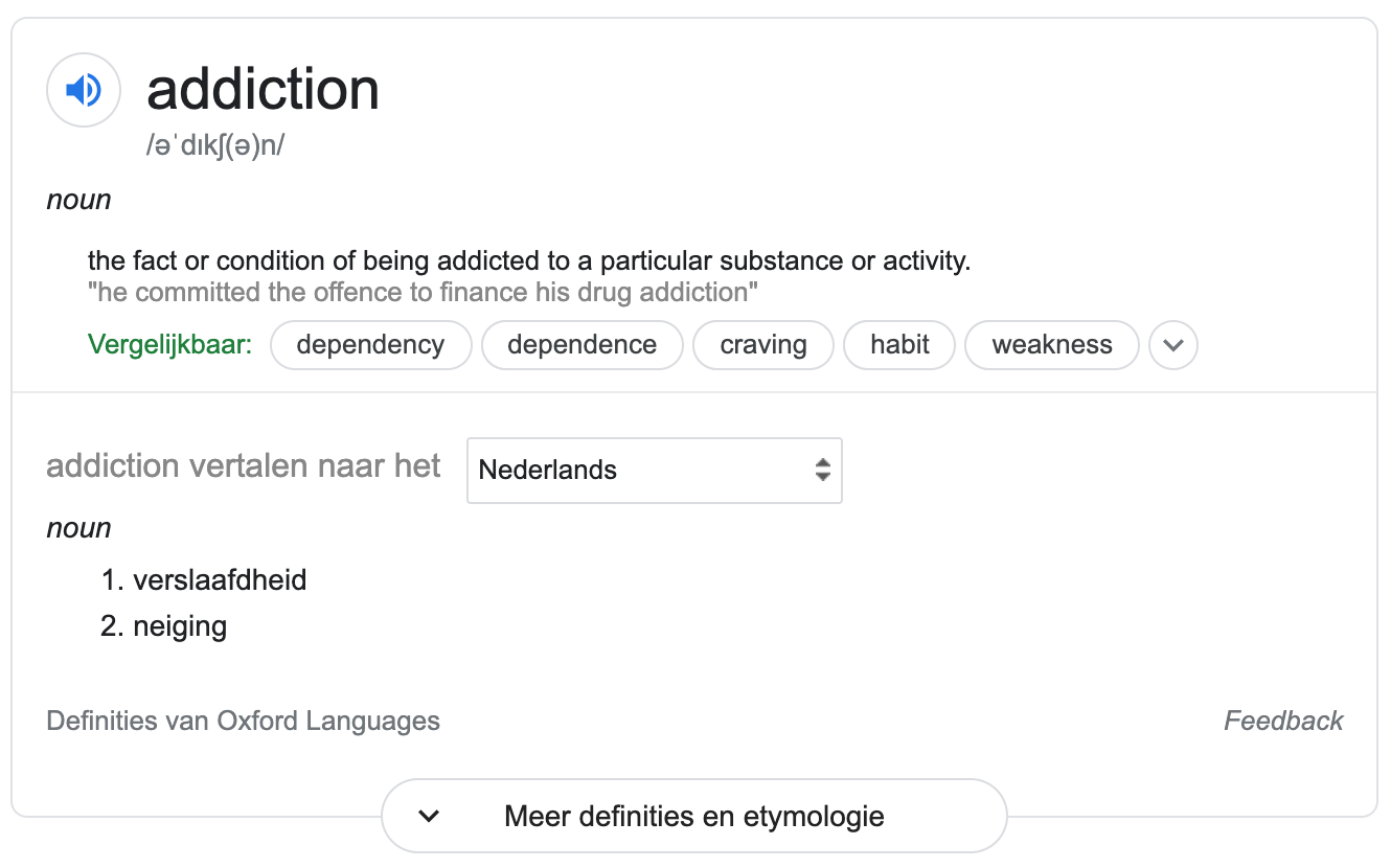
What does addiction means to me?
The need to come back, to return, to do it again, to experience the same as you had before, to get that same feeling.
Plus Plan January 3.2
I am going to work on my resit for the practice. I may continue to work on my other projects, my portfolio website and my own Instagram. I will prepare for the presentation of competence assessment 3.
Schedule:
Week 1:
- Organise my Hotglue page by creating a new overview.
- Decide which direction I want to focus on and take a clear position.
- Do more research after my chosen direction and position.
Week 2:
- Experimenting with ideas based on my research and point of view.
- Start working on my proposal for McDonalds.
Week 3:
- Working further on my proposal.
- Preparing for the final presentation.
Research question:
How is McDonalds influencing kids and how did they become an addiction for them?
Important documentation of my research connected with my research question:
What does influencing means to me?
Influencing, affecting, manipulating behaviour and thoughts, sometimes without knowing.
Influencing by objects in the space
(Marketing)tactics of McDonalds to make kids addicted
Kids get influenced by colours, objects, decoration, design, patterns, posters/flyers, play corners, icons, food smells, radio, little drawings etc.
Digital tactics of McDonalds to influence kids
Using social media and Youtube to reach kids and teens.
Using their website with different games, info, video's and apps.
McDonalds is using kids for designing their Happy meals together with the Ronalds McDonald kids hospital.
Design and rules of the space:
Sizes in the space: Little and big. Little sink for small people like children. Big sink for adults. Little chairs, little playground.
Colours in the space: Yellow, red, green, black, white, wood.
Smell of the space: Little fried smell, little chemical?
Light of the space: Very bright, let lights from the ceiling and sunlight coming thru the big windows.
Music of the space: Radio music, all different kind of populair music, like top 1000.
Temperature: Not very warm, like 18 degrees. So you can eat with your coat on and off.
Textures/materials: coated wood, (fake) leather, plastic, iron. All materials are very easy to clean and strong so they are hard to damage.
How can you feel/see the fast food ideology in the space?
- Quick and simpel food
- Unhealthy food
- Bright colours
- Big logo’s & simpel design
- Big and open space to get many people
- Open almost 24-7
- No plates, no cutlery, no candles
- Plastic tray
- Every food is packet or wrapped in paper.
- Not cosy
- You have to clean up yourself
- No service (due to corona there is now)
Fun for kids. This time I went to the second floor instead of first floor where you have the inside play corner for kids. When I was younger I loved playing there. When I visited the toilet I saw that there were a small and a big sink, one for kids, one for adults. So McDonalds is really a place for kids, where they can grow up with and come back when they are older like nothing has changed, like the old days. That is a small trick to keep their clients and give them a good experience.
Change of color to create a eco-friendly image
McDonald's is using green to create an eco-friendly image.
They are still an 'unhealthy' fastfood company so in this case green does not represents 'healthy' food choices.
The fact that McDonalds is using play (toys, playgrounds, bday parties etc.) to make kids addict to their brand is smart, but it is also very irresponsible. They connect play with fastfood, which causes obesitas and an unhealthy lifestyle for children.
New research question for proposal:
How can I make kids aware of the fact that McDonald's is influencing them?
How can I make kids aware of how McDonald's is making them addicted to their brand through toys and playgrounds?
How can I use play in a way to make kids aware of the fact that McDonald's is making them addicted to their brand? Or is influencing them?
They make customers feel good with a lot of nonsens. Like: Free ranched, 100% natural, no chemicals and antibiotics etc.
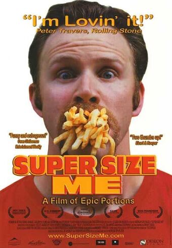
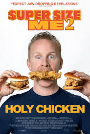
I got inspired and shocked by the documentaries of Morgan Spurman, Super Size Me and Holy Chicken. I want to show the real, the truth instead of hiding it all behind the toys, playgrounds, carrots and apple slices in the Happy Meals.


Satyendra Singh, a professor of marketing and international business at the University of Winnipeg, has studied the use of color in marketing. He's examined how specific hues can influence the way we feel, see, and think. In a 2006 paper for the journal Management Decision, Singh noted that the color red "stimulates appetite." And Karen Haller, one of the foremost authorities on how colors influence buying decisions, told Business Insider that red is linked to "energy" and "excitement."
The distinctive, cheery yellow of McDonald's Golden Arches is also no happy accident. Singh said that fast-food companies tend to use the bright attention-grabbing color to "hijack customers' interests." Haller also pointed out that yellow tends to connote "happiness, optimism, and friendliness." Plus, it's the most visible color to the human eye during daylight hours.
A friendly place to eat that makes you think of happiness? That sounds like someplace you'd like to be, right? Sounds like you'd crave a trip to McDonald's when you see that red and yellow sign on the highway.
In 2018, Paul Findlay, an Australian advertising executive, wrote an article about how the combination of red and yellow reminds us of ketchup and mustard. Findlay asserts that the McDonald's logo, therefore, evokes the experience of enjoying a Quarter Pounder slathered in those bright, distinctive condiments in our minds.
"This simple and very stealthful, sensory trigger lures even the best of us helplessly towards the prize like a pack of fast-food zombies heading eagerly towards a McBrain Burger," he wrote.
Happiness, optimism, friendliness & Mustard
Stimulates appetite, energy, excitement & kethup
eco-friendly, natural, healthy & fresh
I am against the McDonald's chain because I think they should be way more responsabel for their deeds. How they treat animals, how they make people addicted and how they influence them to buy more and more and eat more and more. It is an unhealthy lifestyle for people, and especially for kids because they are easy to influence. How they treat animals according to the documentary about Holy Chicken from Morgan Spurman says a lot. Perhaps in the Netherlands it is a bit better.
In the first documentary about Super Size Me, Morgan is eating a full month only from McDonald's, he walks around 2000 steps a day, that is the average amount of steps for people in the US who visit McDonalds regularly. In three weeks he gained a lot of weight and physical complaints. This is a proof that McDonalds food isn't healthy or good at all, so kids should really be aware of that.
What makes McDonald's so attractive for kids? Why do they don't like a fancy restaurant?
- Freedom, they can play whenever they want to, because McDonald's is offering them an indoor and outdoor playground and not only a colouring page.
- Eat with your hands and they don't have to sit still all the time.
- You get a toy, fries, a burger and a drink all inside one nice box! HAPPY MEALS ARE AMAZING!
- You don't have to wait long for your food, very quick service.
- Colourful and bright colours.
- McDonald's characters like the clown and Happy are the best.
- They use easy words and drawings in their restaurants.
Is it? I think McDonalds have more messages to tell, more important messages that aren't really fun. How can these kids and families create memories that matter? To do something good?
Can I find a balance between, fastfood, healthy food and sports?
Can I make a Healthy Meal instead of a Happy Meal?
Would a change of color influence the choice of kids?
I would like to change the existing systems McDonald's is using now in their spaces to make kids addicted to fastfood, like playgrounds and toys, and reframe these systems to be better for kids.
I would like to see if you change something in these systems to become more healthy if that would change the behaviour of kids. Would they still like to go there? Would it still be fun? Would they still order a (Healthy) Happy Meal? Would they understand that McDonald's makes them addicted to fastfood and their brand?
Is it addiction or a habit? McDonald's is one of the favourite restaurants of kids because they offer them toys, playground etc etc. They offer them a certain freedom compared to other restaurants. They don't have to sit still to wait for their food, they can eat with their hands and play. This is what kids want. But still McDonald's is in control, still McDonald's is the one who is the sugar daddy that lures kids in with nice toys and playgrounds. They offer them a whole collection of toys which you can all collect by purchasing a Happy Meal, which contains fastfood.
1) How can I reframe the systems McDonald's is using to make kids addicted, to become more healthy for kids?
2) How can I give back freedom to kids and make them kick the habit of being addicted to the toys and playgrounds of McDonald's?
McDonald's is like a big sugar daddy that lures kids in.
Sugar = addiction
Do toys and the freedom to play work as a rewarding system for kids? Kids should get a reward if they do something good, like eating their vegetables, right? Not by eating fastfood.
Showing kids the truth? Is this too much?
In and outdoor fitness activities
2) How can I give back freedom to kids and make them kick the habit of being addicted to the toys and playgrounds of McDonald's?
1) How can I reframe the systems McDonald's is using to make kids addicted, to become more healthy for kids?
Change fastfood for a healthy meal
Green McDonald's should have something to do with healthy food right? So let's start with the youngest generation!
But the thing is that most kids don't like healthy food with a lot of vegetables. Do they still don't like it when it is from the McDonald's? Or when they get a toy/reward for finishing their healthy meal?
What if it still looks like a burger, fries, etc. but are all healthy products with vitamins? Change in typography, language?
Healthy addiction, change the systems of McDonalds into healthy systems for children.
PLAY + FASTFOOD = MCDONALD'S
Collect all the veggies, healthy's or vitaminies! Make kids addicted to healthy.
Tips & Tricks to make kids eat more vegetables
The Helping Plate
Make it look freaking nice!
It is all in the name...
I would say that my proposal is designed with a wink of humor, but with a serious message for visitors to think about their lifestyles, to stay fit and eat healthy, also when you visit the McDonald's Alkmaar which is surrounded by sport complexes...
Sporting equipment for the Healthy Meal
Using Healthy as a fitness instructor
I showed my friends, Hannah and Julia a selection of possible sport equipment for the Healthy Meal, I filmed their reactions.
I asked them:
1. Do you know what it is and how to use it?
2. Do you think this is something for kids?
3. Do you think this could be something for the Healthy Meal?
They gave me some feedback afterwards:
1. Make it easy to understand like a step by step description and images.
2. Make it look attractive for kids, nice colours and print etc.
3. Make the sport equipment not too heavy or too big, it still needs to fit in a cardboard box.
4. Think of things kids can do together.
5. Make your Healthy Meal a lighter green, to make it more attractive for kids.
They selected a few items that could fit in the Healthy Meal.
1) Easy to use, not too big, not too heavy, double functions! They can fill it, train with it and drink out of it!
2) This will need some descriptions and tips & tricks of what you can do with it, but it is a small and light object and you can do this alone or with other kids.
3) This is always fun. It will fit in and easy to use, think of nice colours or prints.
4) This will need some descriptions and tips & tricks of what you can do with it. Perhaps it is too big, but it is light and you can do this alone or with other kids.
5) This has to be an inflatable ball, it could be in different sizes, colours or prints which can fit in the Healthy Meal, but the problem is that you can't use it directly.
Healthy as a fitness instructor, new colour!
How would a healthy McDonald's look like?
Change McDonald's into a healthy fitness centre to keep in shape. - McFit - McDonald's Fit
Outside
Inside
Unpack the cones out of the Healthy Meal!
Look for a space, inside or outside where is enough space & where it is safe!
Place all the cones in one line with 5 big steps between them.
Get your friends together!
Everyone starts in line next to the first cone.
5 big steps
<--------------->
The fastest of you is the winner!
Ready to run?
3,2,1... GO!!!
Run to the first cone and back to where you started, run to the second cone and back. Till you have had all the cones.
These instructions can be places on the box of the Healthy Meal or it can be a separate paper in the packaging of the sport equipment, the cones.
These instructions can also be used to tell people how to use a certain fitness device or to give them tips for exercises.
I tested some exercises with my mom to see if eating and sporting can be combined. It worked out quit well.
Testing work out activities
Mappings old
Mappings new
I would say that my proposal is designed with a wink of humor, but with a serious message for visitors to think about their lifestyles, to stay fit and eat healthy, also when you visit the McDonald's Alkmaar which is surrounded by sport complexes...